Connecting to HPC (RAMSES) and Organizing the Workspace
Connect to the HPC
For Windows users: Use MobaXterm. For Mac/Linux users: Use the Terminal application.
Log in to the HPC cluster using your login credentials.
ssh-Y qbius030@@ramses1.itcc.uni-koeln.de# Replace 'qbius030' with your specific username.# Enter passphrase for key '/Users/tahirali/.ssh/ramses_key', if prompted:# Duo two-factor login for qbius030
Check Your Current Directory
pwd
If you are not in your home directory, navigate to it:
cd /home/group.kurse/qbius030/# Replace 'qbius030' with your specific username.
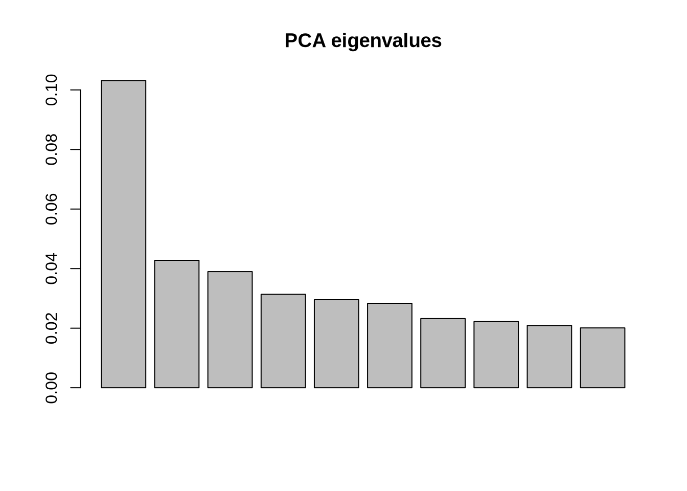
### Step 1: Load necessary libraries ----# These libraries help in handling VCF data, visualizing results, and performing PCA.library(vcfR) # To work with VCF (Variant Call Format) fileslibrary(tidyverse) # For data manipulation and visualizationlibrary(adegenet) # For genetic data analysislibrary(factoextra) # For enhanced PCA visualizationslibrary(FactoMineR) # For multivariate analysis (e.g., PCA)library(RColorBrewer) # For beautiful color paletteslibrary(ggrepel) # For better label placement in ggplotlibrary(htmlwidgets) # For interactive widgets### Step 2: Set working directory ----# Set the directory where your data files are storedsetwd("/home/tahirali/RAMSES_mount/tali/qbio/Practical_Day_2/VCF2PCA") # Adjust path as neededgetwd() # Confirm the directory
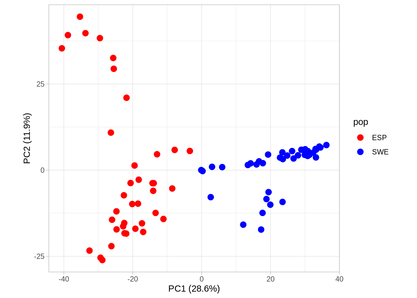
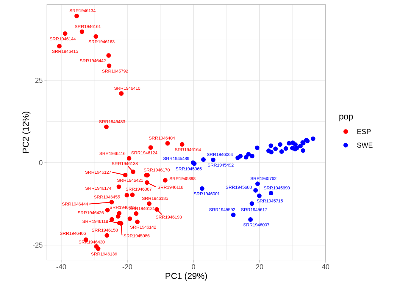
# Plot PC1 vs PC2 with population colorsPC1_2 <-ggplot(pca_2, aes(Axis1, Axis2, col = pop)) +geom_point(size =3) +scale_colour_manual(values =c("red", "blue")) +coord_equal() +theme_light() +xlab(paste0("PC1 (", signif(pve$pve[1], 3), "%)")) +ylab(paste0("PC2 (", signif(pve$pve[2], 3), "%)"))PC1_2
Code
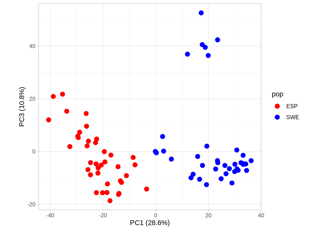
# Plot PC1 vs PC3 with population colorsPC1_3 <-ggplot(pca_2, aes(Axis1, Axis3, col = pop)) +geom_point(size =3) +scale_colour_manual(values =c("red", "blue")) +coord_equal() +theme_light() +xlab(paste0("PC1 (", signif(pve$pve[1], 3), "%)")) +ylab(paste0("PC3 (", signif(pve$pve[3], 3), "%)"))PC1_3
Code
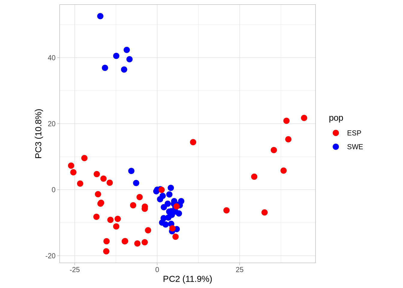
# Plot PC2 vs PC3 with population colorsPC2_3 <-ggplot(pca_2, aes(Axis2, Axis3, col = pop)) +geom_point(size =3) +scale_colour_manual(values =c("red", "blue")) +coord_equal() +theme_light() +xlab(paste0("PC2 (", signif(pve$pve[2], 3), "%)")) +ylab(paste0("PC3 (", signif(pve$pve[3], 3), "%)"))PC2_3
Code
# Save plots to your working directoryggsave("PCA12.png", PC1_2, width =1800, height =1200, units ="px")ggsave("PCA13.png", PC1_3, width =1800, height =1200, units ="px")ggsave("PCA23.png", PC2_3, width =1800, height =1200, units ="px")# Create a labeled plotpca_label <-ggplot(pca_2, aes(Axis1, Axis2, col = pop, label = ind)) +geom_point(size =2) +# size of pointsgeom_text_repel(show.legend =FALSE, size=2) +# Use geom_text_repel() for label repulsionscale_colour_manual(values =c("red", "blue")) +coord_equal() +theme_light() +xlab(paste0("PC1 (", signif(pve$pve[1], 2), "%)")) +ylab(paste0("PC2 (", signif(pve$pve[2], 2), "%)"))pca_label
Code
### Step 7: Interactive 3D Visualization ----# Use plotly to create an interactive 3D plot of PCA resultslibrary(plotly)#3D plotspca_3d <-plot_ly(pca_2, x =~Axis1, y =~Axis2, z =~Axis3, color =pop, colors =c("red", "blue") ) %>%add_markers(size =12)pca_3d <- pca_3d %>%layout(title ="Arabidopsis thaliana Accessions (Sweden & Spain)",scene =list(bgcolor ="#e5ecf6") )pca_3d
Code
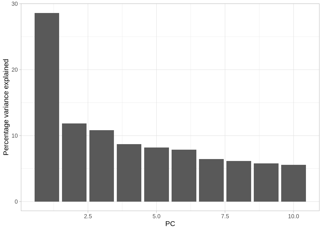
saveWidget(pca_3d, "3D_PCA.html")### Step 8: Multidimensional Splom Visualization ----# Explore relationships between multiple principal components simultaneouslycumsum(pve$pve)
You’ve made great progress today and demonstrated excellent teamwork and dedication. It’s inspiring to see your enthusiasm as you dive deeper into these concepts.
Remember, every step you take brings you closer to mastering these skills. Keep up the curiosity and effort, and don’t hesitate to explore further on your own!
Looking forward to seeing you next time for more exciting challenges and discoveries. Have a great evening! 🌱