---
title: "Species Habitat Suitability Modelling with biomod2"
author: "Dr Tahir Ali | AG de Meaux"
format:
html:
toc: true
toc-depth: 2
code-copy: true
code-fold: true
code-tools: true
code-overflow: wrap
execute:
warning: false
message: false
echo: false
---
```{r, message=FALSE, warning=FALSE, results='hide'}
# Global setup: robust figure handling for Quarto
the_dev <- if (requireNamespace("ragg", quietly = TRUE)) "ragg_png" else "png"
knitr::opts_chunk$set(
fig.path = "figs/",
fig.width = 8, fig.height = 6, dpi = 150,
dev = the_dev,
fig.align = "center",
out.width = "90%",
echo = TRUE, message = FALSE, warning = FALSE
)
dir.create("figs", showWarnings = FALSE, recursive = TRUE)
# macOS Quartz quirks
options(bitmapType = "cairo")
# Load packages
library(sf)
library(terra)
library(biomod2)
library(randomForest)
library(gbm)
library(mgcv)
library(maxnet)
library(xgboost)
library(leaflet)
set.seed(123)
# Robust data loader: use 'sdm' demo if present; otherwise fallback to biomod2 demo
get_demo_data <- function() {
species_file <- system.file("external/species.shp", package = "sdm")
if (nzchar(species_file)) {
# sdm demos (UTM 30N)
species <- sf::st_read(species_file, quiet = TRUE)
path <- system.file("external", package = "sdm")
preds <- terra::rast(list.files(path, pattern = "asc$", full.names = TRUE))
terra::crs(preds) <- "EPSG:32630" # UTM zone 30N
list(species = species, preds = preds, source = "sdm")
} else {
# biomod2 demos (WGS84)
message("Package 'sdm' not available; using biomod2 demo data.")
data(DataSpecies, package = "biomod2")
df <- DataSpecies[, c("X_WGS84", "Y_WGS84", "GuloGulo")]
names(df) <- c("X", "Y", "Occurrence")
species <- sf::st_as_sf(df, coords = c("X", "Y"), crs = 4326)
data(bioclim_current, package = "biomod2")
preds <- terra::rast(bioclim_current)
list(species = species, preds = preds, source = "biomod2")
}
}
# Helper for cropping/zooming projections to preds (study area)
zoom_to_preds <- function(x, preds, method = "bilinear") {
x_proj <- terra::project(x, preds[[1]], method = method)
x_crop <- terra::crop(x_proj, preds)
x_mask <- terra::mask(x_crop, preds)
x_mask
}
```
# Introduction
Welcome to the **Species Habitat Suitability Modelling Workshop**! We will explore how to use **`biomod2`** to fit, evaluate, and project multi-algorithm SDMs under climate change.\
We’ll explore **multi-algorithm modelling**, **model evaluation**, **variable importance**, **ensemble modelling**, and **future projections** under climate change.
### Learning Goals
- Prepare occurrence & environmental data
- Fit multiple algorithms (`GLM`, `GAM`, `RF`, `GBM`, `CTA`)
- Evaluate models and interpret variable importance
- Create ensemble predictions and project under future climates
------------------------------------------------------------------------
# Species Occurrence Data
```{r}
demo <- get_demo_data()
species <- demo$species
preds   <- demo$preds
data_source <- demo$source

head(species)
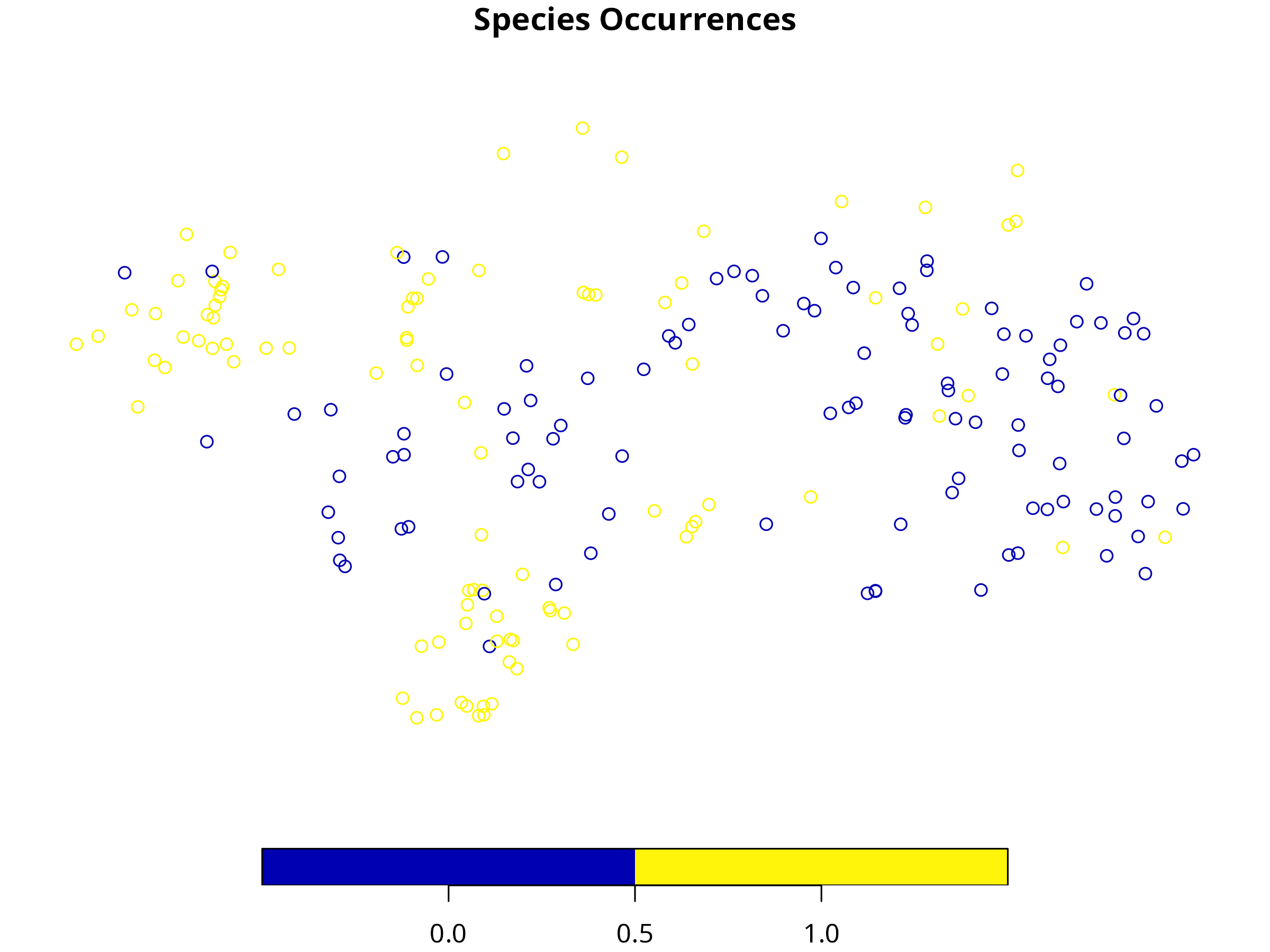
plot(species["Occurrence"], main = "Species Occurrences")
```
**Interpretation:**
- Presence (1) and absence (0) points show the distribution of the species in the study area.
**Interactive Map**
```{r, message=FALSE, warning=FALSE}
species_ll <- tryCatch(sf::st_transform(species, 4326), error = function(e) species)
coords_ll  <- sf::st_coordinates(species_ll)

leaflet(species_ll) |>
  addProviderTiles("CartoDB.Positron") |>
  addCircleMarkers(~coords_ll[,1], ~coords_ll[,2],
                   color = ~ifelse(species_ll$Occurrence == 1, "darkgreen", "red"),
                   popup = ~paste("Occurrence:", species_ll$Occurrence),
                   radius = 5, stroke = FALSE, fillOpacity = 0.8)
```
**Interpretation:** Green = presence, Red = absence. Interactive maps help visualize sampling bias or clustering.
------------------------------------------------------------------------
# Environmental Predictors
**Code**
```{r, message=FALSE, warning=FALSE}
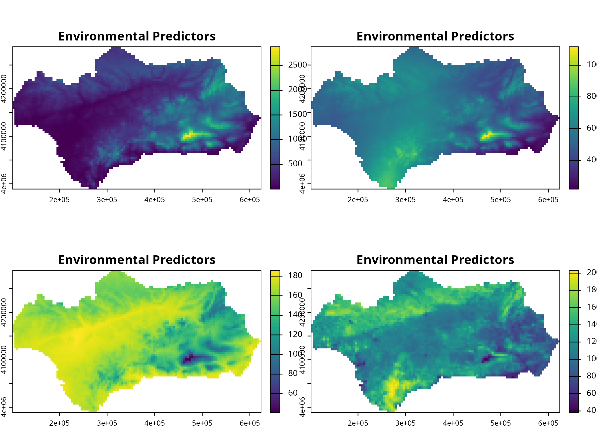
plot(preds, main = "Environmental Predictors")
```
**Interpretation:** These environmental layers (precipitation, temperature, etc.) are predictors for species distribution.
**Output**
```{r, message=FALSE, warning=FALSE}
names(preds)
```
Inspect predictor correlation before modeling! Highly correlated predictors can inflate variable importance.
------------------------------------------------------------------------
# Data Formatting for biomod2
```{r, message=FALSE, warning=FALSE, results='hide'}
myBiomodData <- BIOMOD_FormatingData(
  resp.var  = species$Occurrence,
  expl.var  = preds,                          # SpatRaster
  resp.xy   = sf::st_coordinates(species),    # in same CRS as preds
  resp.name = "MySpecies",
  PA.strategy = "none"
)
```
------------------------------------------------------------------------
# Run SDMs
```{r, message=FALSE, warning=FALSE, results='hide'}
# Create modeling options
myBiomodOptions <- BIOMOD_ModelingOptions()

myBiomodModelOut <- BIOMOD_Modeling(
  bm.format   = myBiomodData,
  models      = c("GLM", "GAM", "RF", "GBM", "CTA"),
  bm.options  = myBiomodOptions,
  CV.strategy = "random",
  CV.nb.rep   = 3,
  CV.perc     = 0.7,
  metric.eval = c("TSS", "ROC"),
  var.import  = 5,
  seed.val    = 123
)
```
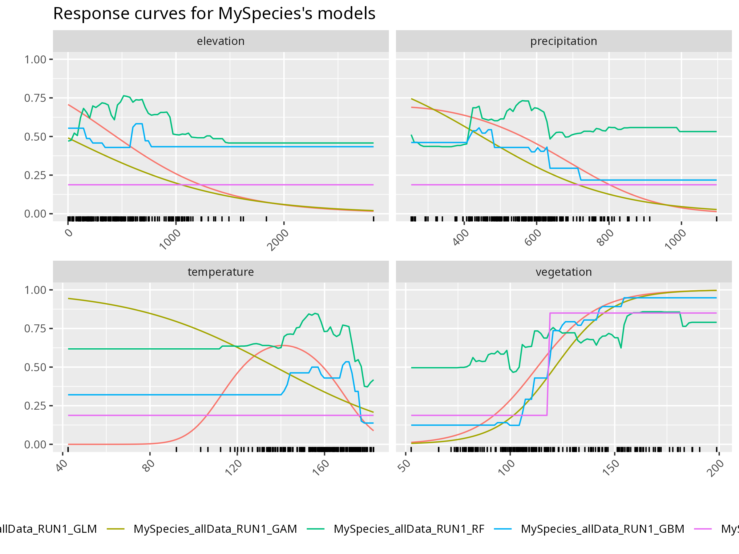
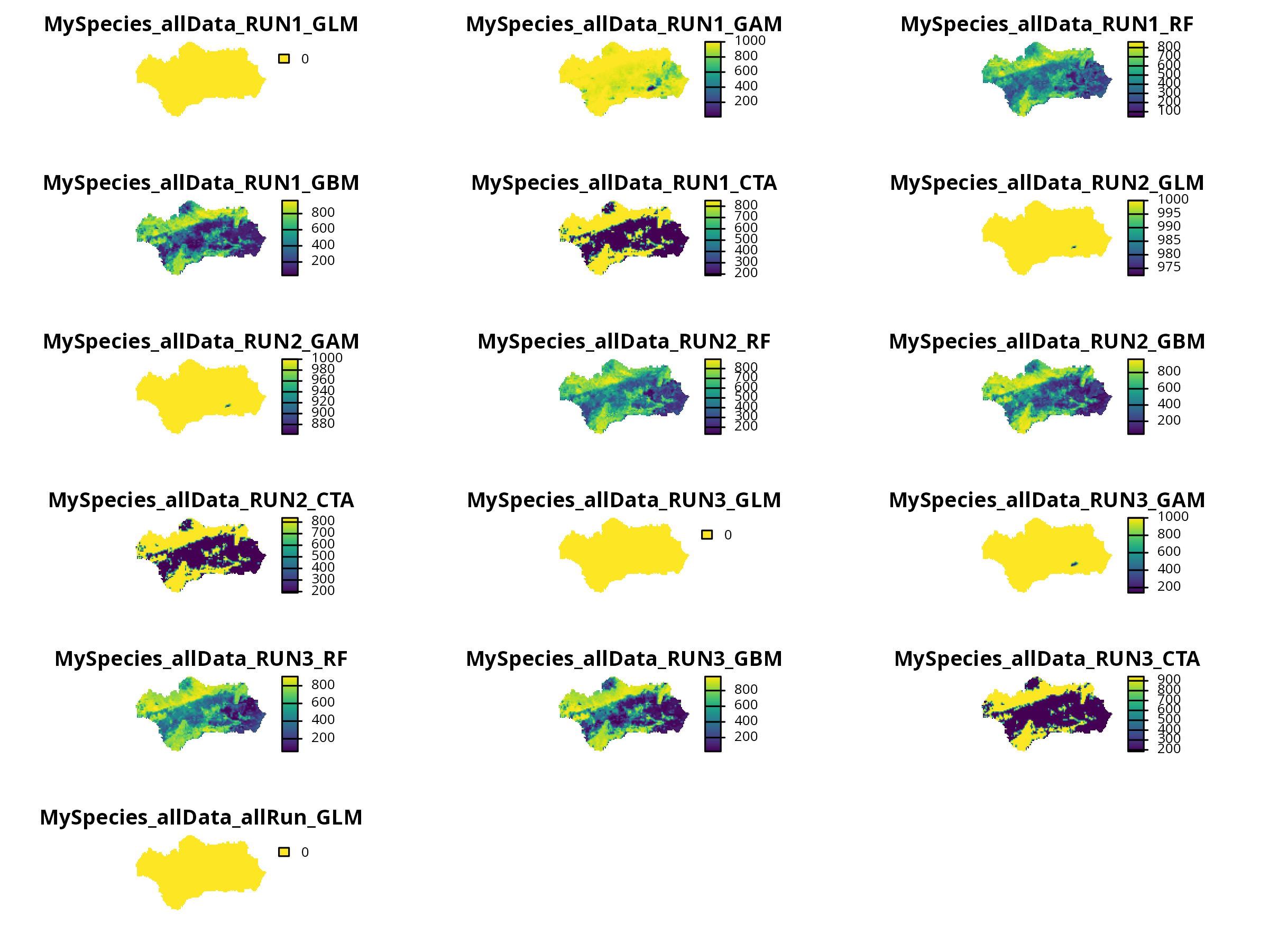
Each algorithm captures a different relationship between environment and occurrence — ensemble methods help combine their strengths.
```{r, message=FALSE, warning=FALSE, results='hide'}
mods <- get_built_models(myBiomodModelOut, run = "RUN1")
invisible(
bm_PlotResponseCurves(
bm.out = myBiomodModelOut,
models.chosen = mods,
fixed.var = "median"
)
)
```
**Further Deepen Your Understanding:**
- How does the predicted probability of presence change with each environmental variable?
- Are there thresholds or nonlinearities in the response?
------------------------------------------------------------------------
# Model Evaluation
**Code**
```{r, message=FALSE, warning=FALSE, results='hide'}
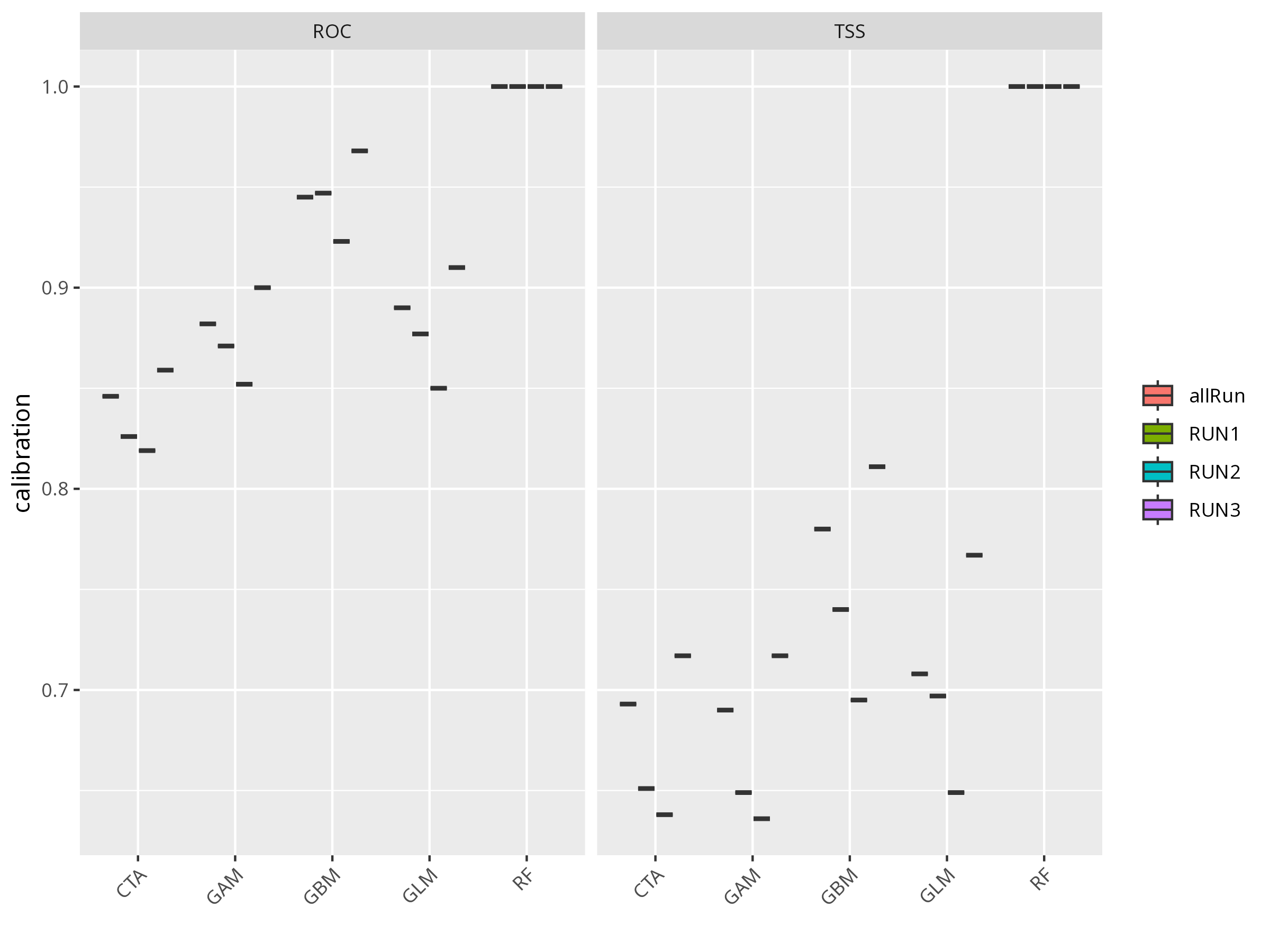
evals <- get_evaluations(myBiomodModelOut)
print(evals)
```
**Plot**
```{r, message=FALSE, warning=FALSE, results='hide'}
invisible(
  bm_PlotEvalBoxplot(myBiomodModelOut))
```
**Think about:**
- Which model performed best (by TSS or ROC)?
- Are there any models that performed poorly? What could be the reason?
- What does a high TSS or ROC value mean in ecological terms?
- What does that imply about nonlinearity in the data?
**Further Deepen Your Understanding:**
- Compare the evaluation metrics across models. Discuss possible reasons for differences (e.g., overfitting, data structure, algorithm assumptions).
------------------------------------------------------------------------
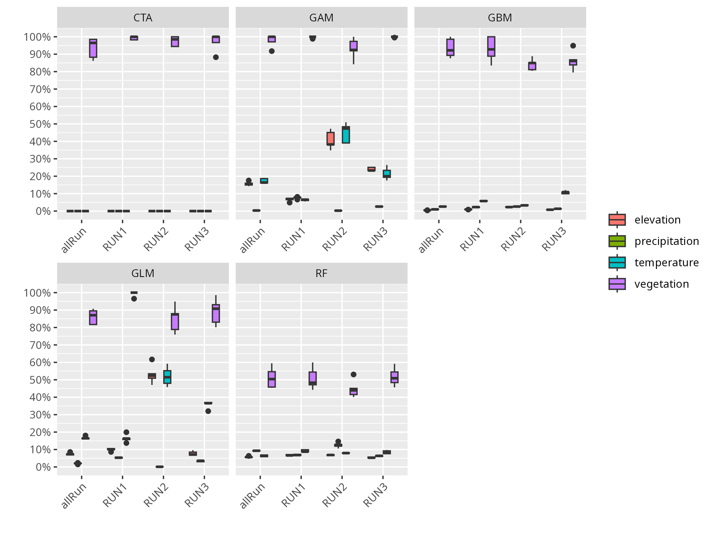
# Variable Importance
**Code**
```{r, message=FALSE, warning=FALSE, results='hide'}
varimp <- get_variables_importance(myBiomodModelOut)
print(varimp)
```
**Plot**
```{r, message=FALSE, warning=FALSE, results='hide'}
invisible(
  bm_PlotVarImpBoxplot(myBiomodModelOut))
```
**Think about:**
- Which environmental variable is most important for predicting the species’ distribution?
- Are there variables that seem unimportant? Why might that be?
- How might variable importance change if you used a different species or study area?
**Further Deepen Your Understanding:**
- Discuss how variable importance can inform conservation or management decisions.
------------------------------------------------------------------------
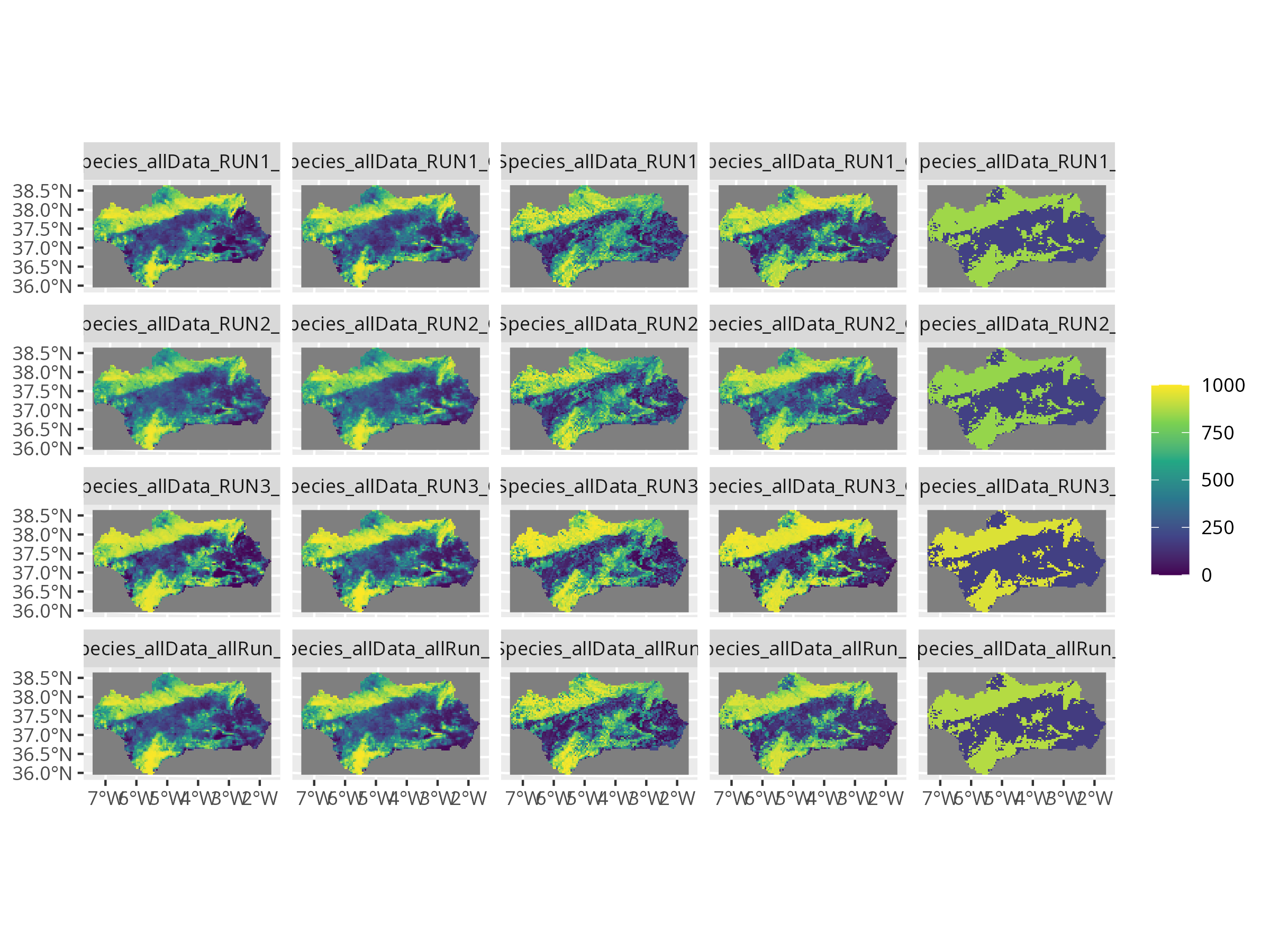
# Project to Current Environment
**Code**
```{r, message=FALSE, warning=FALSE, results='hide'}
myBiomodProj <- BIOMOD_Projection(
  bm.mod = myBiomodModelOut,
  new.env = preds,
  proj.name = "current",
  selected.models = "all",
  binary.meth = "TSS"
)
```
**Map**
```{r, message=FALSE, warning=FALSE, results='hide'}
invisible(plot(myBiomodProj))
```
------------------------------------------------------------------------
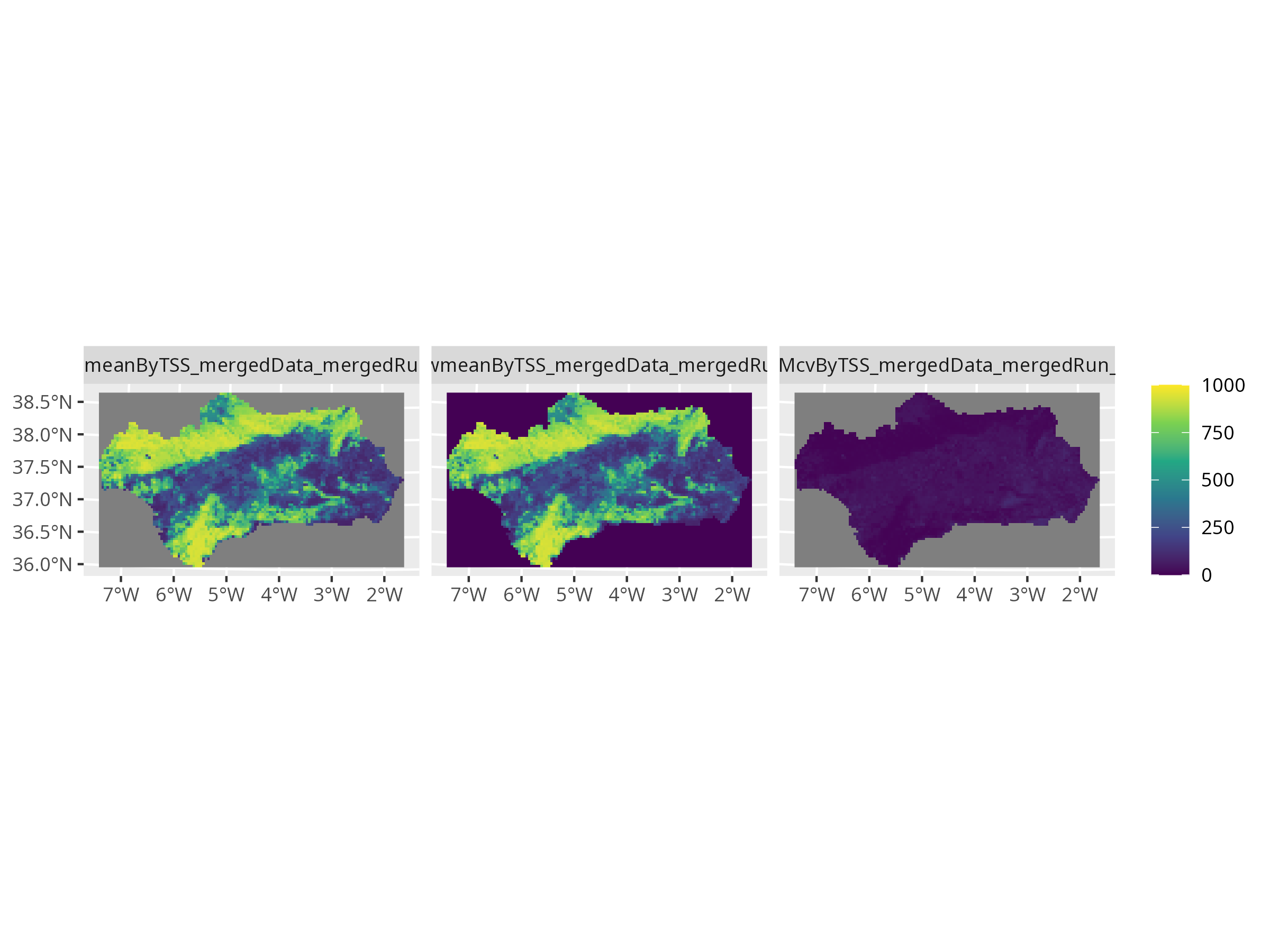
# Ensemble Modeling
**Code**
```{r, message=FALSE, warning=FALSE, results='hide'}
myBiomodEnsemble <- BIOMOD_EnsembleModeling(
  bm.mod = myBiomodModelOut,
  models.chosen = "all",
  em.by = "all",
  em.algo = c("EMmean", "EMwmean", "EMcv"),
  metric.select = "TSS",
  metric.select.thresh = 0.5,
  metric.eval = c("TSS", "ROC")
)

myBiomodEnsembleProj <- BIOMOD_EnsembleForecasting(
  bm.em  = myBiomodEnsemble,
  bm.proj = myBiomodProj
)

# biomod2's internal plot (can look squished for multiple panels)
invisible(plot(myBiomodEnsembleProj))
```
The weighted mean ensemble (EMwmean) gives higher weight to better-performing algorithms.
**Why it looks compressed** - biomod2's internal plotting code does not preserve the raster’s coordinate ratio. - It sets up a multi-panel layout (mfrow) to plot multiple ensemble models side by side. - Each panel is drawn with equal x/y units, not the spatial extent ratio, so the map looks "squished".
**Solution** - Extract predictions and plot with terra::plot()
This gives you correct aspect ratio and prettier maps:
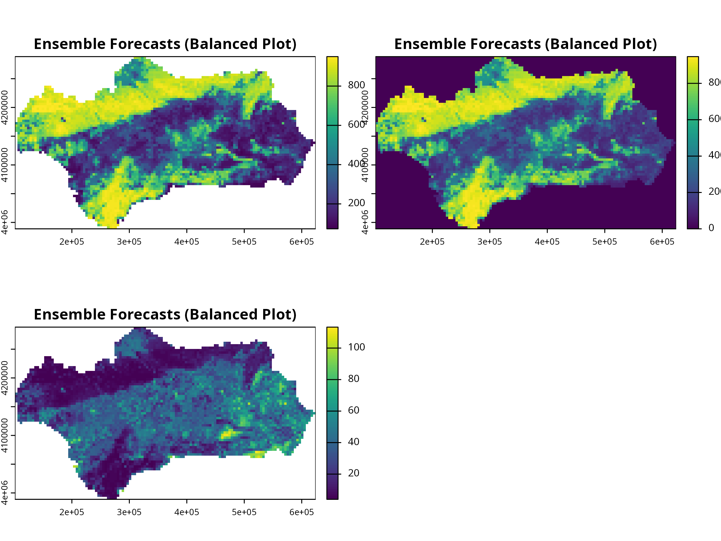
```{r, message=FALSE, warning=FALSE, results='hide'}
# Balanced aspect using terra
ens_rast <- get_predictions(myBiomodEnsembleProj)
terra::plot(ens_rast, nc = 2, main = "Ensemble Forecasts (Balanced Plot)")
```
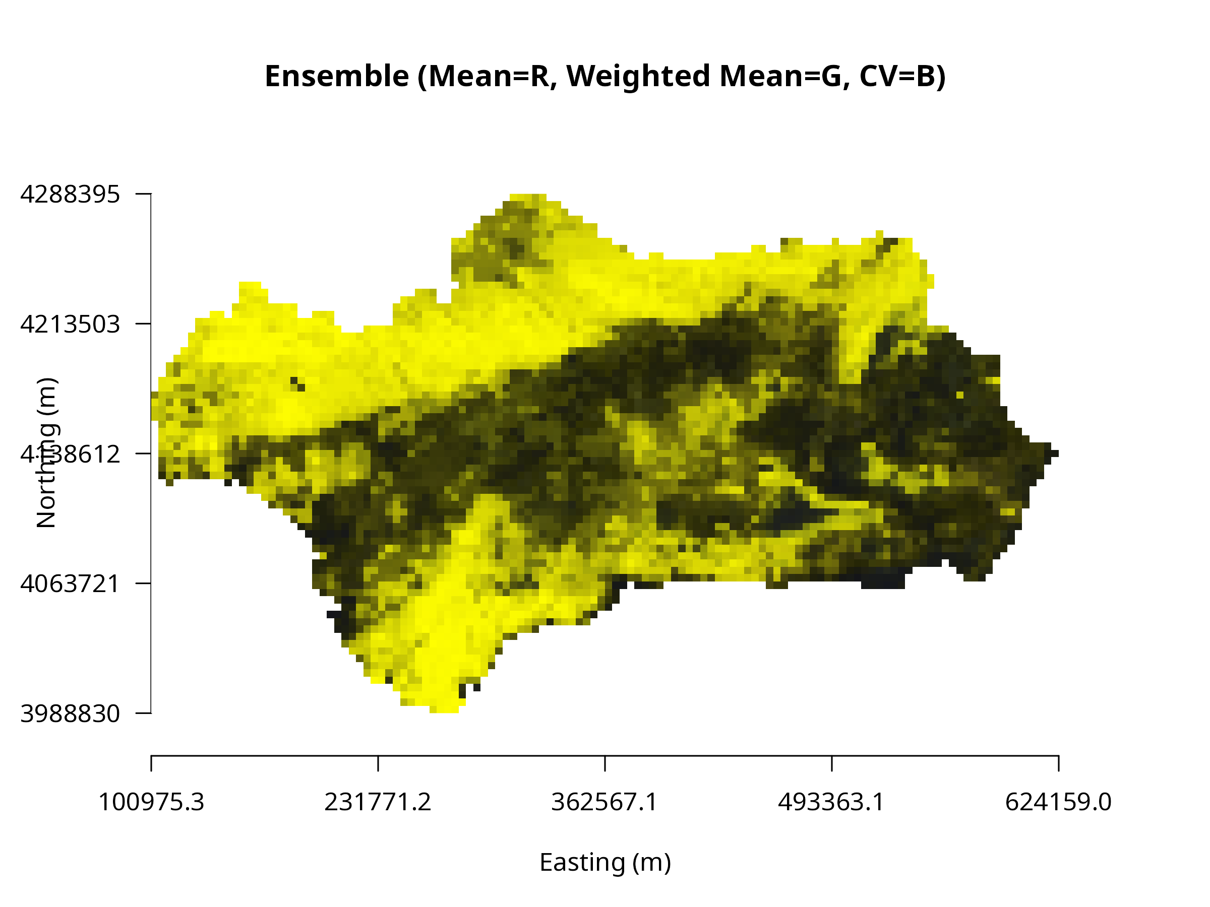
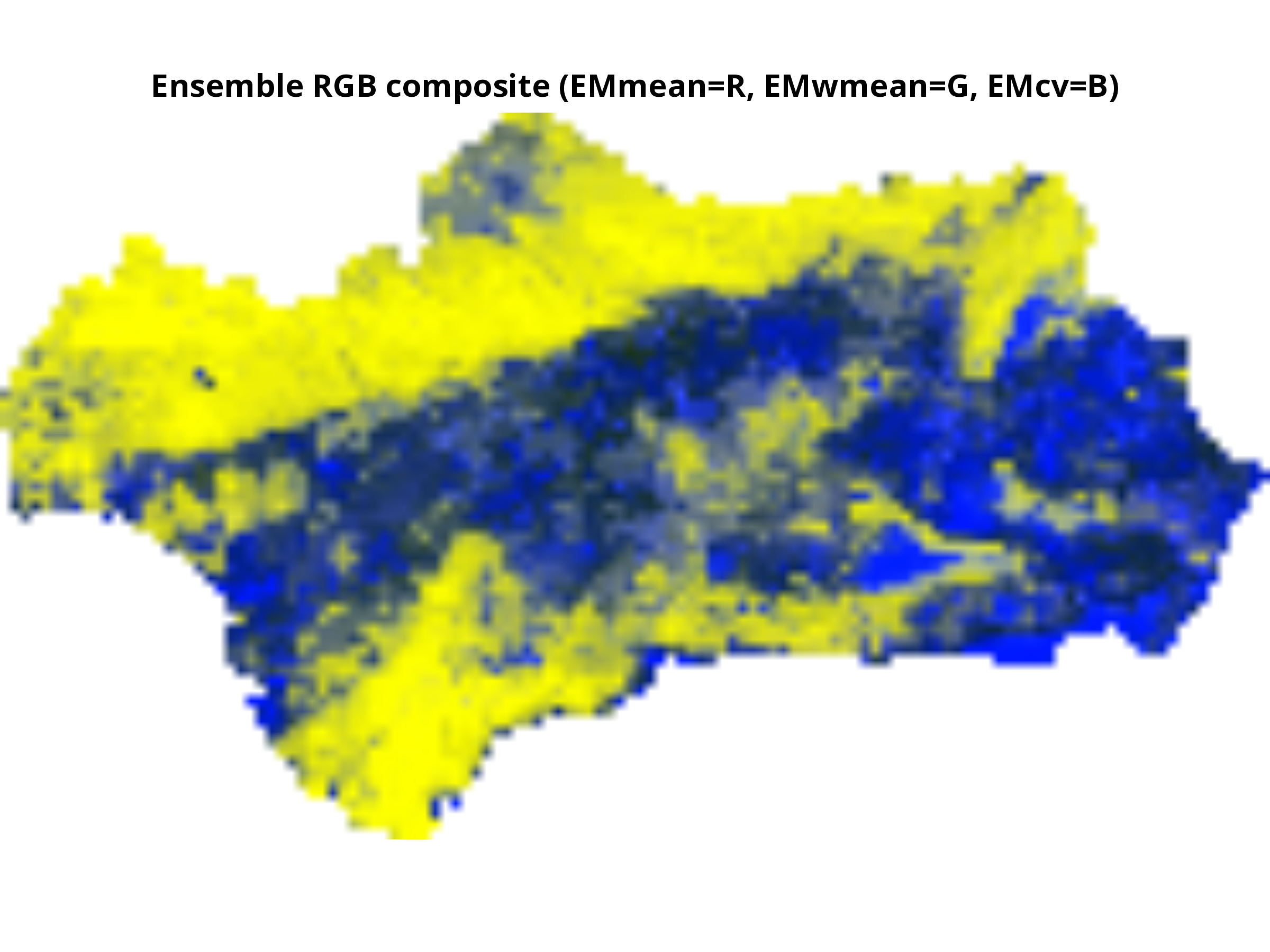
**Using plotRGB() — composite visualization**
plotRGB() displays three raster layers as R–G–B channels (e.g., temperature in red, precipitation in blue, elevation in green). It’s ideal for visualizing covariate contrasts or model uncertainty (mean, sd, cv).
```{r, message=FALSE, warning=FALSE, results='hide'}
# Extract RGB layers safely
layer_ids <- grep("EM(mean|wmean|cv)ByTSS", names(ens_rast))
if (length(layer_ids) < 3) {
  message("⚠️ Expected 3 ensemble layers (mean, wmean, cv), found ", length(layer_ids), ".")
  message("Available layers are: ", paste(names(ens_rast), collapse = ", "))
} else {
  ens_rgb <- ens_rast[[layer_ids]]

  # Rescale values to 0–255
  stretch <- function(x, minv=0, maxv=255){
    vals <- values(x)
    vals_scaled <- round((vals - min(vals, na.rm=TRUE)) /
                         (max(vals, na.rm=TRUE)-min(vals, na.rm=TRUE)) * (maxv-minv) + minv)
    values(x) <- vals_scaled
    return(x)
  }

  ens_rgb <- stretch(ens_rgb)

  # Convert to RasterStack for plotRGB
  ens_rgb_r <- raster::stack(ens_rgb)

  # Plot RGB composite
  par(mfrow=c(1,1), mar=c(5,5,5,5))
  plotRGB(ens_rgb_r, r=1, g=2, b=3, scale=255,
          axes=TRUE, xlab="Easting (m)", ylab="Northing (m)",
          main="Ensemble (Mean=R, Weighted Mean=G, CV=B)")
}
```
**Interpretation:**
- **Red** → areas with high mean suitability
- **Green** → strong weighted mean influence
- **Blue** → high variability among models
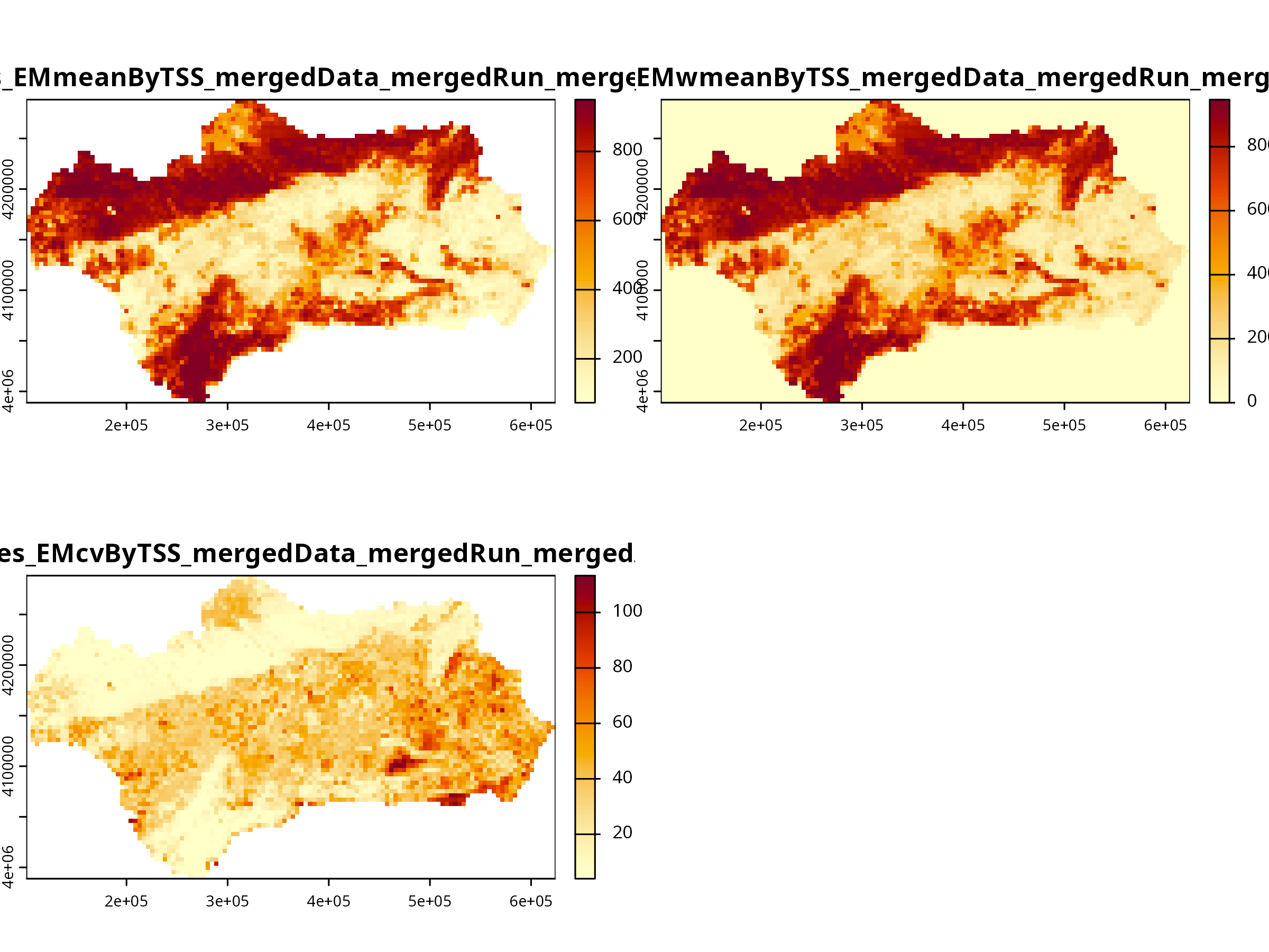
**Optional Enhancement:** View each layer separately with consistent color palette
```{r, message=FALSE, warning=FALSE, results='hide'}
cols <- hcl.colors(100, "YlOrRd", rev = TRUE)
plot(ens_rast, col = cols)
```
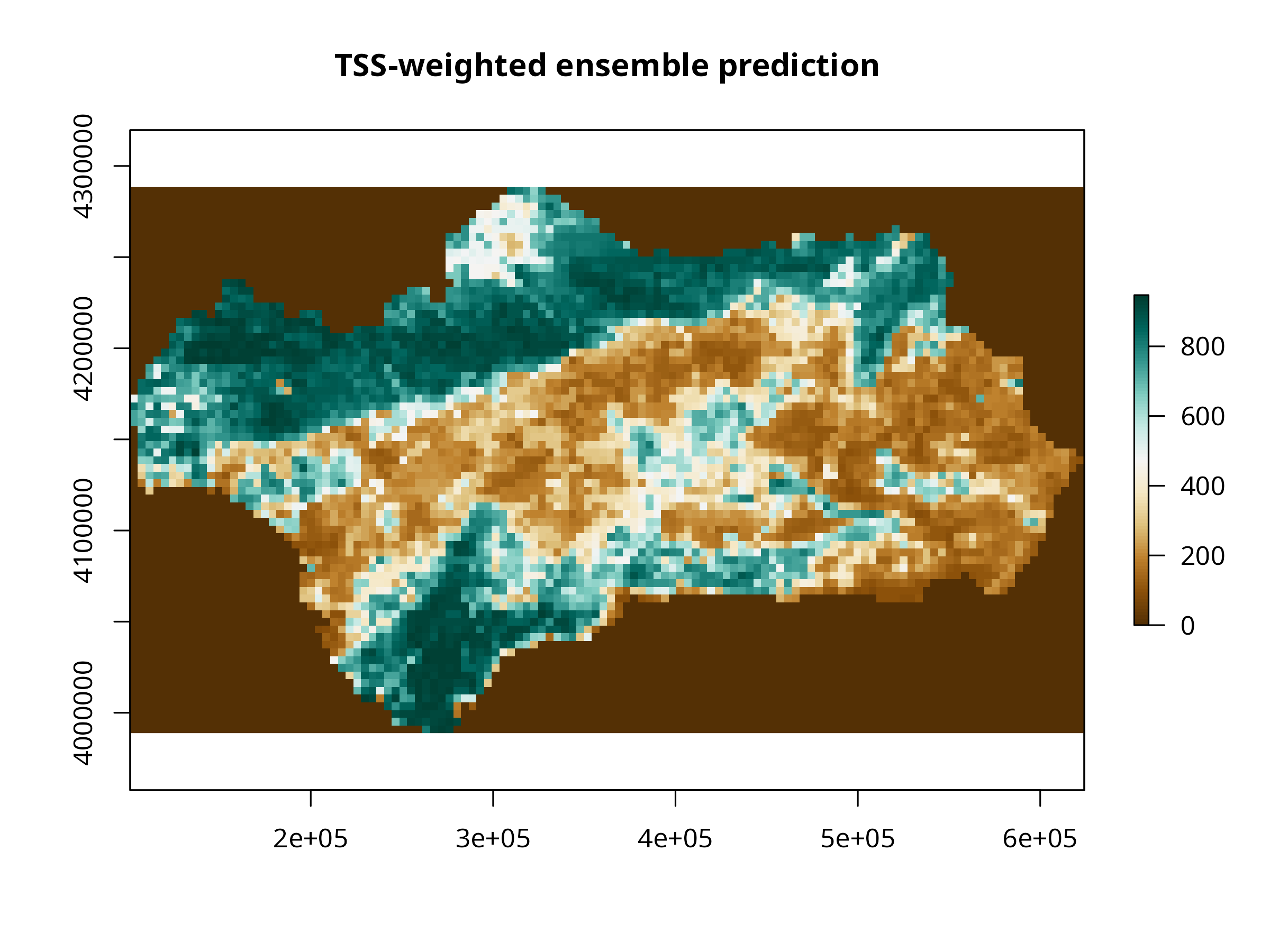
```{r, message=FALSE, warning=FALSE, results='hide'}
library(terra)
library(raster)
library(RColorBrewer)
library(sp)

# Convert terra SpatRaster to raster (Raster* object)
ens_raster <- raster::stack(ens_rast)

# Inspect names to select the right layer
names(ens_raster)
# Example: "MySpecies_EMwmeanByTSS_mergedData_mergedRun_mergedAlgo"

# Subset the TSS-weighted layer
ens_layer <- ens_raster[["MySpecies_EMwmeanByTSS_mergedData_mergedRun_mergedAlgo"]]

# Check for values
summary(ens_layer)
# If it shows only NAs, projection/resampling step might have failed.

# Optional: replace NAs with 0 or mask to study area
# ens_layer[is.na(ens_layer[])] <- 0

# Define a nice color palette
cols <- colorRampPalette(RColorBrewer::brewer.pal(11, "BrBG"))(100)
plot(ens_layer,
     col = cols,
     main = "TSS-weighted ensemble prediction",
     axes = TRUE,  # shows coordinates
     box = TRUE)
```
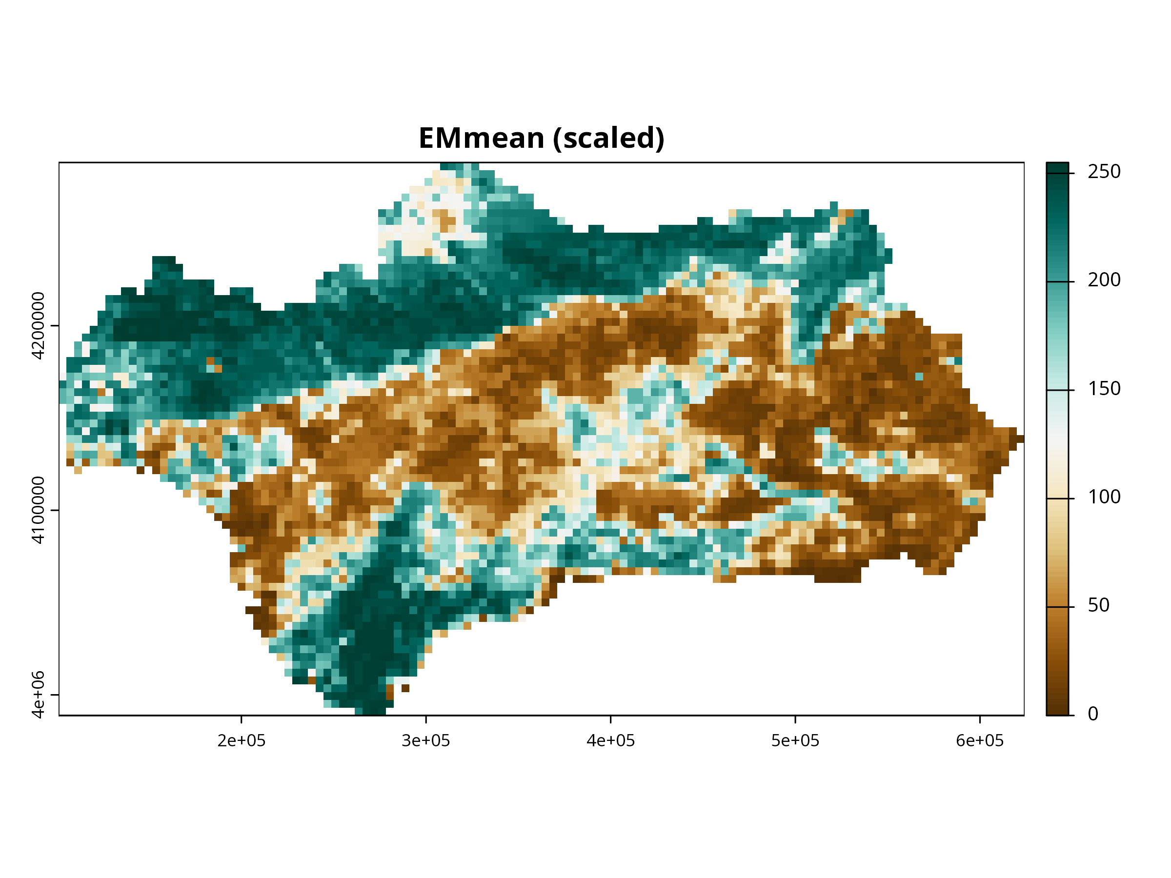
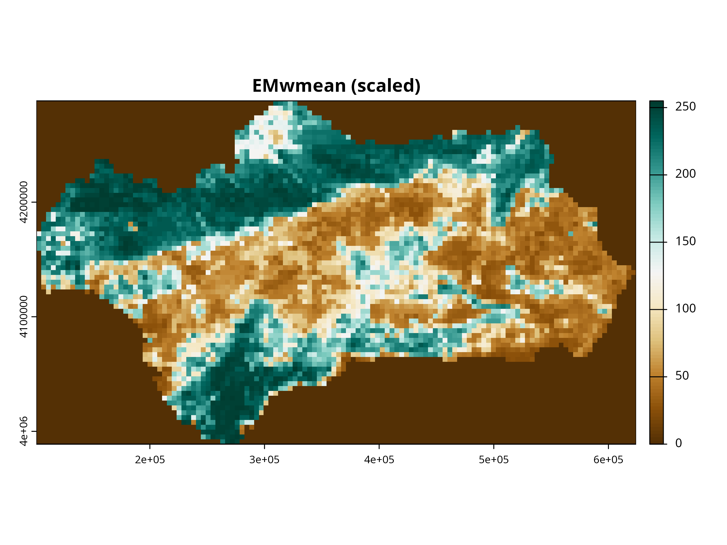
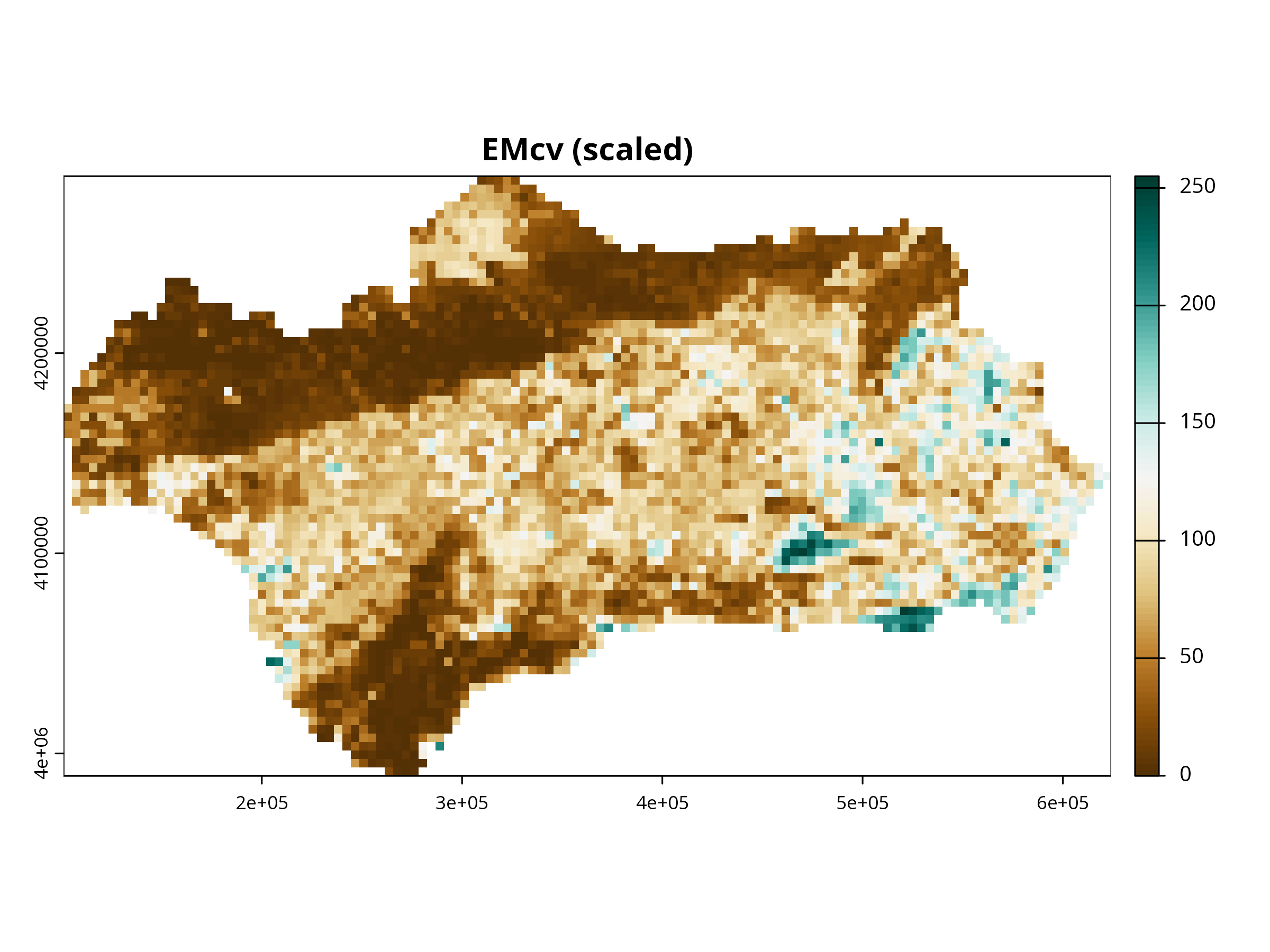
You can also produces a color-tuned visualization of all three ensemble layers, scaled and plotted like an RGB composite (or single-color maps), with axes and proper legends using terra.
```{r, message=FALSE, warning=FALSE, results='hide'}
library(terra)
library(RColorBrewer)

# Extract ensemble raster stack
ens_rast <- get_predictions(myBiomodEnsembleProj)

# Optional: check names
names(ens_rast)
# [1] "MySpecies_EMmeanByTSS_mergedData_mergedRun_mergedAlgo"
# [2] "MySpecies_EMwmeanByTSS_mergedData_mergedRun_mergedAlgo"
# [3] "MySpecies_EMcvByTSS_mergedData_mergedRun_mergedAlgo"

# Select the three layers
layers <- ens_rast[[c(1,2,3)]]

# Scale each layer to 0-255 (RGB scale)
scale_to_255 <- function(x) {
  vals <- x[]
  vals_scaled <- round( (vals - min(vals, na.rm=TRUE)) / (max(vals, na.rm=TRUE) - min(vals, na.rm=TRUE)) * 255 )
  x[] <- vals_scaled
  return(x)
}

layers_scaled <- lapply(layers, scale_to_255)
layers_scaled <- rast(layers_scaled)
names(layers_scaled) <- c("EMmean","EMwmean","EMcv")

# Plot single layers with custom color palettes
cols <- colorRampPalette(brewer.pal(11, "BrBG"))(100)

for (i in 1:3) {
  plot(layers_scaled[[i]],
       col = cols,
       main = paste0(names(layers_scaled)[i], " (scaled)"),
       axes = TRUE, box = TRUE)
}
# Optional: RGB composite (assign layers to R, G, B channels)
# Only works if all layers are scaled 0-255
plotRGB(layers_scaled, r=1, g=2, b=3, scale=255, stretch="lin",
        main="Ensemble RGB composite (EMmean=R, EMwmean=G, EMcv=B)")
```
**Think about:**
- How does the ensemble prediction compare to individual models?
- What are the advantages of using an ensemble approach?
- How does model uncertainty (e.g., prob.cv) inform your confidence in predictions?
**Further Deepen Your Understanding:**
- Where are the highest predicted suitability values?
- Are there areas of high uncertainty (compare with EMcv or EMci projections)?
- How does the ensemble map compare to individual model projections?
------------------------------------------------------------------------
# Future Climate Projection
```{r, message=FALSE, warning=FALSE, results='hide'}
if (data_source == "sdm") {
  # 19 bioclim variables (place your file in the project folder)
  # Example file name; change if needed
  future_2070 <- try(rast("future_2070_bioclim.tif"), silent = TRUE)
  if (inherits(future_2070, "SpatRaster")) {
    if (is.na(crs(future_2070))) crs(future_2070) <- "EPSG:4326"

    temp_f   <- future_2070[[1]]   # bio1
    precip_f <- future_2070[[12]]  # bio12

    elev_c <- preds[["elevation"]]
    veg_c  <- preds[["vegetation"]]

    # Align current to WGS84 of future
    elev_wgs <- project(elev_c, temp_f)
    veg_wgs  <- project(veg_c,  temp_f, method = "near")

    ext_study   <- ext(elev_wgs)
    temp_crop   <- crop(temp_f,   ext_study)
    precip_crop <- crop(precip_f, ext_study)

    elev_res <- resample(elev_wgs, temp_crop)
    veg_res  <- resample(veg_wgs,  temp_crop, method = "near")

    # Stack with same names & order as training
    preds_future_sel <- c(elev_res, precip_crop, temp_crop, veg_res)
    names(preds_future_sel) <- c("elevation","precipitation","temperature","vegetation")

    # Project
    myBiomodProjFuture <- BIOMOD_Projection(
      bm.mod = myBiomodModelOut,
      new.env = preds_future_sel[[c("elevation","precipitation","temperature","vegetation")]],
      proj.name = "future_2070_fix",
      selected.models = "all",
      binary.meth = "TSS",
      compress = FALSE
    )

    # Crop projection back to study area (preds footprint)
    r  <- get_predictions(myBiomodProjFuture)
    r_zoom <- zoom_to_preds(r, preds)
  } else {
    message("future_2070_bioclim.tif not found; skipping future projection.")
    r_zoom <- NULL
  }
} else {
  message("Using biomod2 fallback data; future-projection demo (elev/veg + bio) is skipped.")
  r_zoom <- NULL
}
```
**Think about:** - Discussion: How do predicted suitable regions shift?
- Are expansions or contractions consistent with ecological expectations?
- How could this information be used in conservation planning?
------------------------------------------------------------------------
```{r, message=FALSE, warning=FALSE, results='hide'}
if (!is.null(r_zoom)) {
  terra::plot(r_zoom, nc = 3, mar = c(2,2,2,3), axes = FALSE)
}
```
# Export Outputs
```{r, message=FALSE, warning=FALSE, results='hide'}
# Export ensemble weighted mean (if built)
if (exists("myBiomodEnsembleProj")) {
  ensemble_rast <- get_predictions(myBiomodEnsembleProj)
  wmean_name <- grep("EMwmeanByTSS", names(ensemble_rast), value = TRUE)
  if (length(wmean_name)) {
    ens_wmean <- ensemble_rast[[wmean_name]]
    writeRaster(ens_wmean, "ensemble_weighted_mean.tif", overwrite = TRUE)
  }
}

# Optional: export cropped future projections
if (!is.null(r_zoom)) {
  writeRaster(r_zoom, "future_2070_projection_cropped.tif", overwrite = TRUE)
}
```
Now you can import your results into QGIS or ArcGIS for spatial overlay with land-use or protected areas.
------------------------------------------------------------------------
# Try It Yourself
Modify one of the following:
- Use **different algorithms** (e.g., Maxent, XGBoost).
- Add **pseudo-absence generation**.
- Use **k-fold spatial cross-validation**.
- Compare projections for **two SSP scenarios (245 vs. 585)**.
------------------------------------------------------------------------
# Summary
✅ Prepared occurrence and environmental data ✅ Fitted multi-algorithm SDMs ✅ Evaluated models and explored variable importance ✅ Built ensembles and projected under climate change
------------------------------------------------------------------------
**Curious Questions:**
- How could you use these outputs in QGIS or ArcGIS?
- What are the limitations of SDM outputs for real-world decision making?
# Discussion and Reflection
**Group Discussion Prompts:**
- What are the main sources of uncertainty in SDMs?
- How would you improve the data or modeling process?
- What ethical considerations arise when using SDMs for conservation or management?
# Ideas for Student Mini-Projects
- Try modeling a different species (change the resp.var). Add or remove environmental predictors and see how results change.
- Compare results using different cross-validation strategies (e.g., k-fold, block).
- Explore the effect of sample size by subsetting the data.
# References
Thuiller W., Georges D., Engler R., Breiner F. (2023). **biomod2: Ensemble platform for species distribution modeling**. R package version 4.5.4. Hijmans, R. J. (2023). **geodata: Download Geographic Data**. R package version 0.6-3.